Devlog #6
The weekend is upon us. This week we will give you a sneak peak at the new interface, the shop and explain how the cutscenes have turned out.
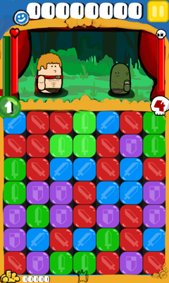
Lets start with the new interface. As we said last week iFest was the wake up call to make the interface brighter and more interesting to look at. You can check out the concept I made for the new battle screen below. Firstly the boring greys of the borders have been replaced for a much brighter yellow and lovely blue. The major change however is the HUD (Heads Up Display) layout and sizes. These changes are fairly necessary as it helps draw the eye to the various aspects of each one. The big text the top is meant to make the score stand out a lot more. The experience bar now connects to your level bubble so it ties both of them together more so hopefully people understand they are connected. Taking health off the bottom of the puppets gives us more room to position and size them on the stage, also it should help drive home the fact which is your health and how much health the enemy has. The money you collect after defeating enemies is down the bottom as it isn’t as important to the gameplay as the other elements.

Some may think its silly to spend more time on rearranging these elements but it can make a huge difference to your game. Moving these elements should make things more obvious and help accentuate what things are important gameplay-wise.
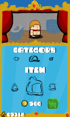
Next we wanted to show you what the general idea with the store is. If you have been following, you can customise your puppet to look however you want by changing things such as your hat, eyes, clothing, face accesory etc. The shop is going to be where you can spend in-game coins to purchase other items for your costumes. You will earn these coins everytime you defeat a monster, and the amount of coins will probably relate to how hard you hit them on the last hit. It’s always nice to be rewarded for playing games and so having cool items for you to buy and dress your puppet in is a nice way to say thank you.

The final part of the devlog will be the current state of the cutscenes. Azza finished writing the code to handle them all and all thats left is to write lots and lots of content. We had a few ideas of how to so the cutscenes, and the obvious one is to just have the puppets come on stage and act their part. This does fit the puppet show theme to a tea however it reduces some of what we can do with the story. What we have ended up with is a sort of comic book style paneling where the puppets act their part and when the major bit of story is done there, the next panel lights up and progresses the story. We think this way it will be more exciting for the player, it also allows us to show a more complex story quicker and considering its designed as a mobile game its always a good thing.
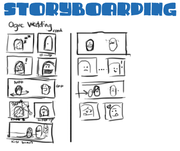
I’ve attached a quick story board i drew up this week of the Ogre Weddings opening and closing cutscenes. I have felt guilty that the last 2 entires haven’t had any eye candy so I’m trying to make up for it this week. It may be rather hard to tell whats going on with my scrappy concepting but I’ll give you the quick rundown of what the opening cutscene to this play is.
Panel 1: The princess is sleeping in her bed.
Panel 2: The door slowly creaks open.
Panel 3: The princess is startled by the sound and wakes up.
Panel 4: The ogre groom shows his face and says hi.
Panel 5: The princess runs back and forth screaming.
Panel 6: The princess gets bonked on the head by the ogres club and it fades to black.
Panel 7: She wakes up in a wedding dress.
Panel 8: It shows shes standing next to the ogre who is in a Tux and is making Kissing sounds at her.

So the direction we are taking in the cutscenes is quick and cute. All the puppets will speak with chipmunk voices and express what they are feeling through their actions. This was a good way to make things easier for ourselves but also gives the player a chance to use their own imagination and fill in the gaps on what exactly might be going on or what the puppets are saying to eachother.
Well that should do it for this weeks blog. Hope you are all enjoying reading this each week. Its looking like I will have finished making the new interface early next week and get onto that gameplay video I’m sure you are all waiting on.
Till next time!
Devlog #5
Hello again, time for another blog post to tell you whats been happening with us and Puzzle Puppets. iFest was fantastic, we had a great day meeting all the other indie guys from Melbourne, we got lots of feedback and people had a fun time playing our game which is always a good sign. I’ll tell you some of the note worthy things that happened that day:
- We looked incredibly dashing in our t-shirts
- An iFest judge said our game us “strangely addictive”
- Being stuck in a corner behind a pole with no room to move makes it hard to grab people to play your game :\
- We got more votes for our game then we thought we would so yay us
- Everyone was very polite and gave great feedback
- The kids picked up the game faster then most of the older gamers
- Open bars are delicious, apple crumbles and chilli shots all round
- The Melbourne indie guys are a good bunch of blokes
Well the week after iFest was more of a lazy week hence the no devblog for that Friday. We ended up working on some of the business side of running an indie company and trying to sort out funding and accounting stuff. We also tried to catch up on some games we haven’t played. For people wanting to make games, playing all sorts of games is a very good idea as you can learn something from every single one.
So what have we been up to this week working on the game you say? Currently Aaron is implementing the cut-scenes in the game. We always wanted some sort of story to help reward you for progressing through the levels and so Aaron has been working on making that happen. We had wanted to update the interface since we had moved further from the old idea and iFest was the last straw. The game looked less inviting and not as colourful as you would want for this cheerful puppet show and so I’ve been chipping away at the menu to make it look more pleasing and fun. The other reasons for the interface change is to also make certain aspects stand out more because players didn’t pay much attention to it during their demo.
Enjoy the weekend and once we have the new interface up we will post a video so you can see some puppet fighting action.
Devlog #4
This will be a short update as we are still busy preparing for iFest tommorow. If you live in Melbourne, Australia feel free to come to the State Library opposite Melboourne Central Station and come play a whole bunch of indie games and listen to people in the industry talk about various subjects.
Check out iFest for more details.
If you do come down to see us you will be able to play our game on either of our 2 laptops or the phone itself. You will be able to chat and ask questions all through the day so dont be shy.
There was a lot of polish this week, taking debug and testing cases out of the game. We added more particles and sound effects so there should be more feedback then ever in the game.
Well sorry about the short blog post but we do aim at making some sort of gameplay video very soon so you can see the game in action. We hope to see some of you this weekend.
Follow Us!